Blackberry
WEBSITE LAUNCH & LIGHT REBRAND
Creative Direction, Art Direction, UI, Website Design, Logo Treatment, MultiMedia


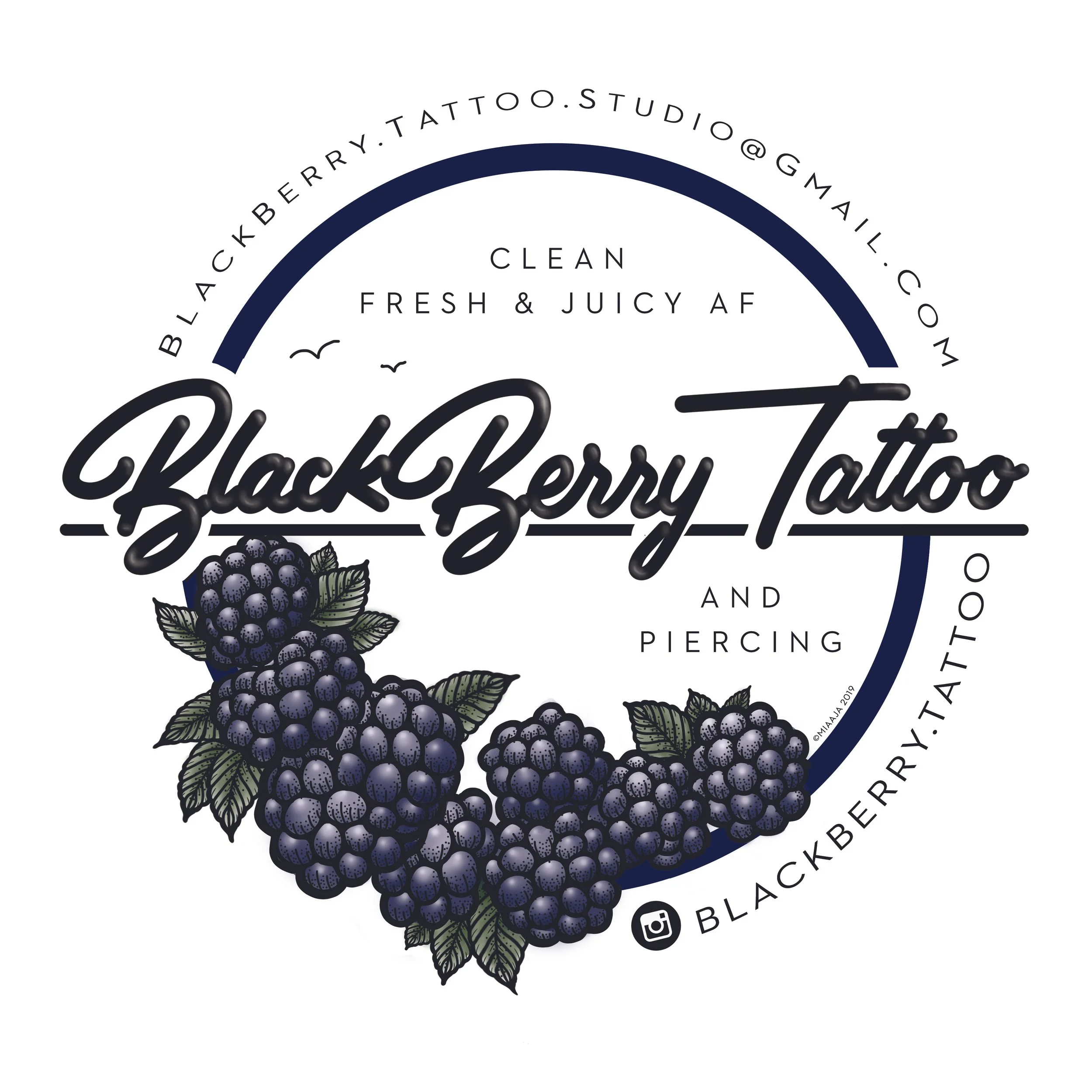
We created a simplified version of BlackBerry Tattoo’s logo (right) that respected the original (left) but made it legible for digital use, as well as providing clean and classic logotype variations.


ORIGINAL

UPDATED


User Journey
When designing BlackBerry’s website, my priority was creating a very to-the-point use journey, with as few steps as possible, while honoring the client’s shop and tattoo aesthetic.


The Result
I designed a simple approach, dividing the two services to be the main menu options, with each of those buttons directing you to the “Schedule” page or the “Gallery” (which also redirected to the “Schedule” page).
This flow increased traffic and conversion rates over 10x.